Fly UX project
Creating a smooth flight booking process from scratch

Role
UX Design Student
Work
Final project for UX Design Institute - Professional Diploma in UX
Duration
12 months
Tools
Sketch
Figma
Creately
In 2021, I signed up for a comprehensive course called Professional Certificate in UX Design at UX Design Institute. Alongside all the teaching of the whole UX Design process and everything in between, we were to create and design a medium fidelity prototype of a flightbooking site with detailed wireframes. The booking process was to meet all the design principles and guidelines to create a simple, intuitive process that was based on a deep understanding of the users.
Research
Analysis
Design
Prototype
Wireframing
Research
To be able to create the best possible booking process I needed to find success factors and key problems with already existing flight booking sites. I started with competitive benchmarking to see how other best in class competitors hade chosen to solve their design problems. After that I went on to study a ready made usability test, and last I conducted my own usability test including depth interviewing.

Competitive benchmarking
Great first step in research. Although this was only from my point of view as a designer, it was quite obvious which parts of the websites were helpful and which parts that were troublesome.

Usability testing 1
One of the most powerful tools a UX designer has. Watching a ready made usability test gave me deep insights into the user experience of the tested flight booking sites.
I especially looked for
GOALS
BEHAVIOURS
MENTAL MODELS
PAIN POINTS
CONTEXTUAL INFORMATION
Usability testing 2
For this usability test I had acquired a random user that would help me in getting more insights into how a user interacts with the software of a booking process. I started with an interview to get to know the user's life a bit more before going into the test. To the test I had defined clear goals of what to achieve.
Analysis
After conducting all my research I had a lot of messy information to use. For the research to be of any benefit I needed to sort it and analyze. Gladly there is an excellent tool for this, the affinity diagram. Later on I also did a customer journey map to sort my findings further into the right section of the journey.

Affinity diagram
Amazing analyzing tool if you ask me. For this session we were two persons going through all the research findings, and sorted out what could be useful in the new website.
Customer journey map
I was thrilled about this analyzing tools. This map gave me as a designer a clear overview of what parts of the booking process that were most complicated and needed extra attention and consideration in the design work.

Findings and core user needs
No room for ambiguity
Is the price for one or two persons? "I cannot find the serach-button"..
In order for the booking process to be smooth the information presented must be clear and organized in a way so that the user knows exactly what to do next.
Interactive calendar function a must
Not in any usability test the user tries to put in dates herself. Every person uses a calendar, but a calendar itself has many function, so make sure they are synced and user friendly.
Remove unneccessary cluttery information
Show only neccessary and useful information. Big flashy advertisements or blurry information is annyoying to the eyes.
Most problematic area
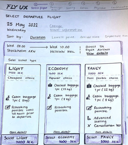
The research showed clearly that the most problematic part of the booking process is the flight selection area where there is massive information about different flights, times, prices, baggages and extra add-ons. Room for improvement!
Follow conventions that work well
All my test users seemed to know the convention of baggage options and what was included in the prices quite well. So continue with that.
Call to action buttons
A few times through my research it was obvious that the call-to-action buttons where not clear enough.
Going into design
Based on, the now structured research findings, I could create my first interaction design. This map shows how the user will flow and go from one step to another in the booking process. The squares represent the screens with information, and the circles represents what the user will do to come to the next step in the process.


![[Mockup] iPhone Fly UX.png](https://static.wixstatic.com/media/28c786_3fb8a0fd57f34dc2841e5b3c671af333~mv2.png/v1/crop/x_311,y_271,w_1462,h_1823/fill/w_442,h_551,al_c,q_85,usm_0.66_1.00_0.01,enc_avif,quality_auto/%5BMockup%5D%20iPhone%20Fly%20UX.png)