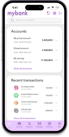
UI for Banking application
Creating the UI for a banking application that is playful, clear and trustworthy.

Role
UX Design Student
Work
Final project for UX Design Institute - Professional Diploma in UI
Duration
3 months
Tools
Figma
In this course the objective was to create the UI for a new banking application. The task was to design polished user interfaces for three key screens that should work responsively across desktop, tablet and mobile. The applications look and feel should reflect the brand principles of playful, clear and trustworthy.
Design approach
Like any other design project, I started this one by looking for inspiration.
I looked for already existing banking application, for playful elements, for inspiring fonts and other UI elements that I could use in my own banking application. I organized my findings and created
-
An underlying grid system for desktop, tablet and mobile
-
Set of fonts and a typographic scale
-
A color palette
-
An icon set
-
A mood board with all the element above

Mood board
Brand and personality
Playful design elements
Playful colors together with icons
Hand drawn circle to highlight heading
Geometrical shapes for welcoming page and content page
Clear design elements
Use of icons together with heading make the meaning more clear
Organizing the content into logical boxes and working with a lot of white space
Trustworthy design decision
Sticking to conventional design that users are used to
Use of clear design elements will also make the design trustworthy

Color palette
In order to make the application playful I chose to use a set of playful colours together with icons.
However I chose the background colour to be light grey and white to keep the application clear and trustworthy.
The main colour - light purple - is in my mind, both playful and trustworthy since it radiates both power and creativity.

Icon set
Use of icons in this application matches all key principles.
Black icons used together with headings make the meaning more clear.
Color icons for describing payments make the meaning both clear and playful.
Another choice of making elements playful and clear I used a hand drawn circle to highlight the heading.
Geometrical shapes are used in the welcoming page for a playful touch.

Fonts and typographic scale
Choosing fonts for this application was a journey. After having tried different fonts like Open sans, Lato, Nunito Sans and Inter, I ended up choosing Avenir next, since I thought that it was both playful, clear and stylish at the same time.


